
What Are You Looking At

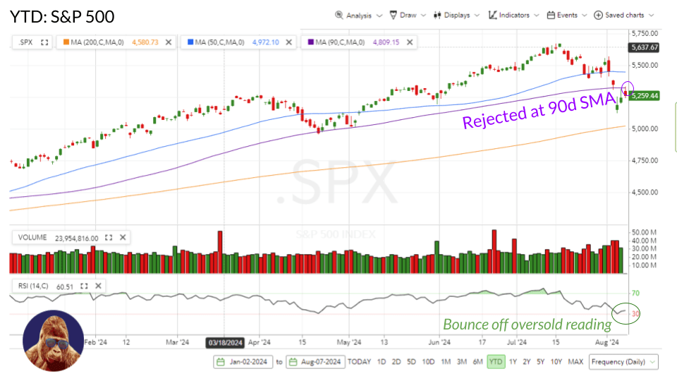
Given the context of the sell-off – with tech at the epicenter of the yen-carry trade unwind – it is not a surprise that recovery in the tech-heavy NASDAQ looks the least convincing. The S&P 500, with its 32% allocation to tech, isn’t faring much better. I view the recoveries in the NASDAQ and S&P 500 as the least convincing because these indices encountered resistance at lower levels compared to their counterparts.
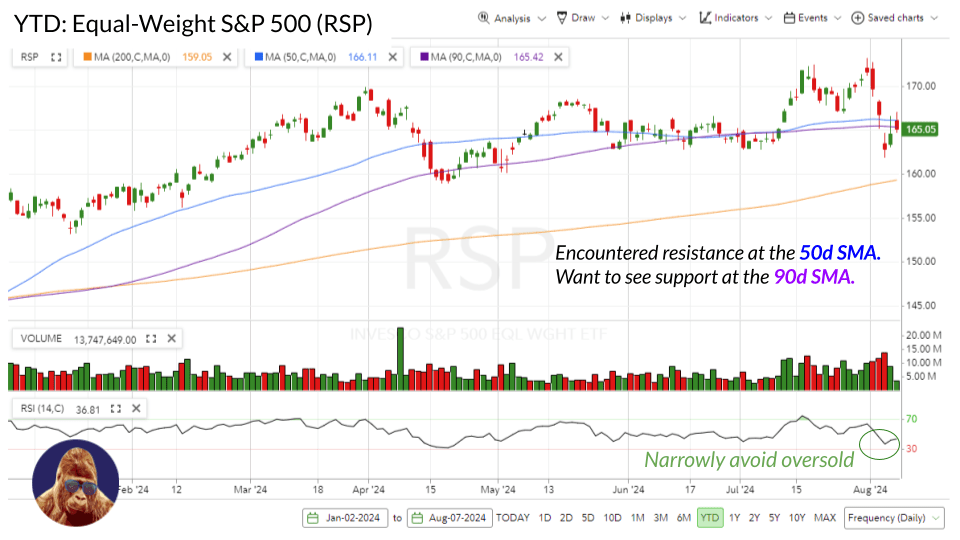

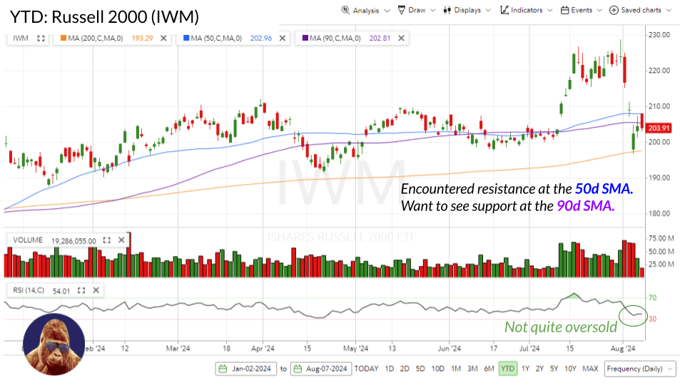
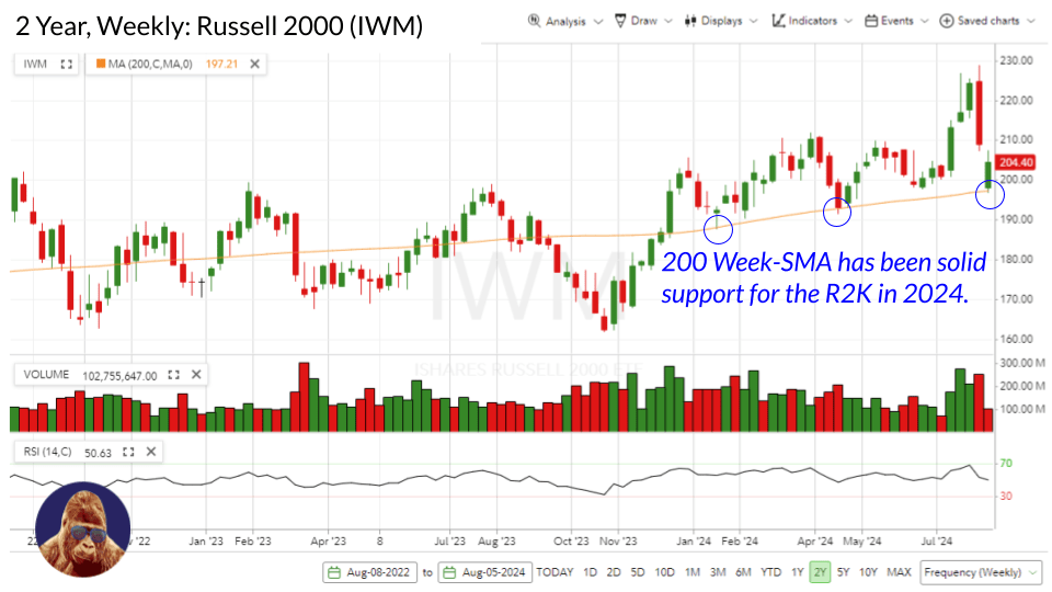
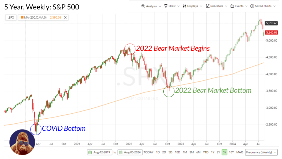
Speaking of, the recoveries within the Russell 2000 (IWM), Equal-Weight S&P 500 (RSP), and Dow Jones Industrial Average did not encounter resistance until they surpassed higher technical levels, which suggests a greater amount of money went there on the bounce. Notably, the IWM found support at the 200-week SMA, a significant technical level. For reference, it is where the S&P 500 made its bottom in 2022. Now, none of this guarantees that the money stays, but these technical levels are of consequence to traders – human and algorithmic. Hopefully, each index firms up at the close to reclaim their 90d SMAs on a closing basis.
What Does It Mean
The superior recovery in the more cyclical indices – Dow, Russell 2000, Equal-Weight S&P 500 – relative to the indices with deeper exposure to technology – NASDAQ and S&P 500 – implies that the consensus is that the economy and earnings will hold up. If the consensus were drifting toward recession, then the rebound in cyclical indices wouldn’t look more compelling than the rebound in secular growth indices.
Put another way, I see the charts as acknowledging the reassuring economic data and corporate earnings released on Monday and Tuesday, justifying skepticism toward last Friday’s hastily made recession forecast.
I do not mean to discredit anyone who got caught up in Monday’s craziness. A lot happened all at once. I’ve never seen the VIX act like that. With so much happening all at once, it is difficult to determine what’s what in real-time. This stuff is hard.
The Next Hurdle
Tomorrow morning at 8:30 AM, the weekly initial jobless claims report will be released. Last week, it registered 249k; consensus for this week is 240k. I believe 250-300k is viewed as the danger threshold. If initial jobless claims come in above the consensus, these charts could break. Market are drifting lower into the close. Perhaps, this is an attempt to get out of the way of this release.
In English:
The charts suggest Monday’s sell-off was due to a huge trade going wrong and not a change in the economy or economic outlook. That is bullish.
The panic has been bought, but the follow-through is still in question.
While Monday wasn’t about the economy, last Thursday and Friday were. Again, the charts look promising, but I expect them to break if Thursday’s initial jobless claims give the market a reason to forecast a weaker U.S. economy and a lower earnings forecast. In the event these do break, you can forget everything I just said. However, after the VIX briefly became a senior citizen overnight, it is hard to foresee another quick flash-panic to a single piece of data given what we know now.

Leave a Reply